The CSS Renaissance
If you haven't looked at CSS in a while, you're in for a surprise. The language has matured into a powerful tool that makes many old hacks (like using JavaScript for element queries) obsolete. In 2026, the challenge isn't making things look right—it's managing the complexity of a large-scale design system.
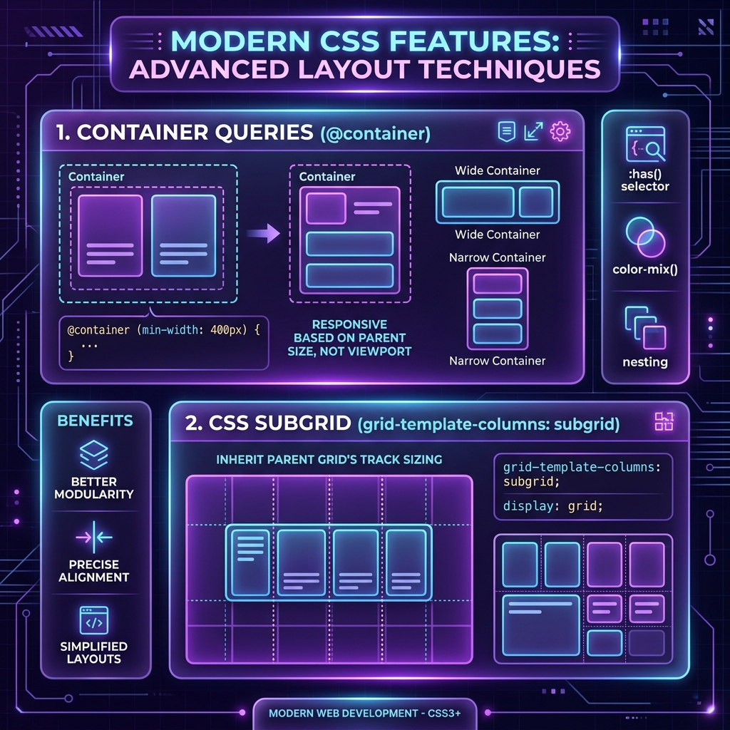
Container Queries: True Component Autonomy
For years, we've relied on Media Queries to make things responsive. But Media Queries are tied to the viewport. Container Queries allow a component to change its layout based on the size of its parent container. This is the "Holy Grail" of component-driven design.
.card-container {
  container-type: inline-size;
}

@container (min-width: 400px) {
  .card {
    display: grid;
    grid-template-columns: 1fr 2fr;
  }
}
Native CSS Nesting
CSS now supports native nesting, similar to Sass. This reduces boilerplate and keeps related styles together without needing an external preprocessor.
.button {
  background: blue;
  color: white;

  &:hover {
    background: darkblue;
  }

  & .icon {
    width: 20px;
  }
}
The Evolution of Utility-First CSS
Tailwind CSS v4 has fundamentally changed how we think about utility classes. With zero-runtime overhead and incredible performance, it's become the default for most Next.js projects. However, the key to success with Tailwind is composition, not just throwing classes at an element.
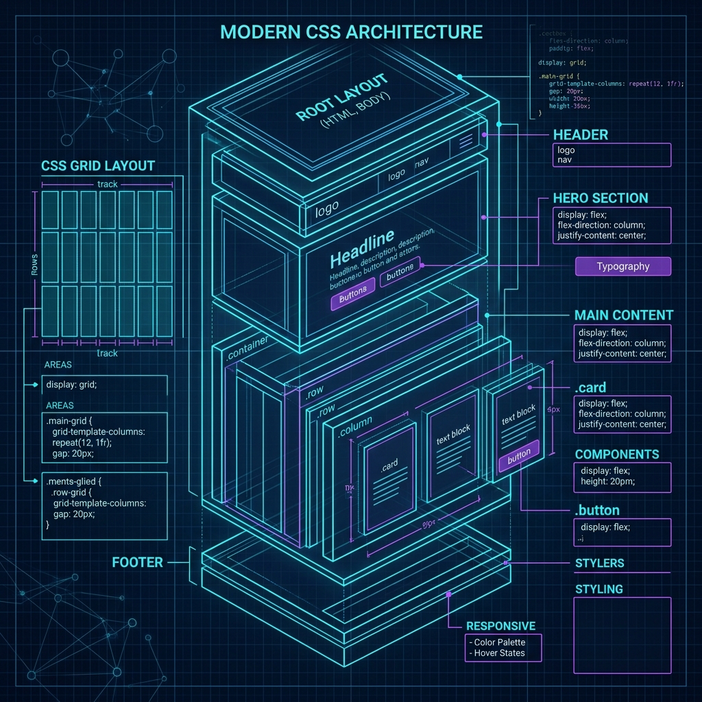
Modern Design System Best Practices
- Define a Theme: Use CSS variables (Custom Properties) for colors, spacing, and typography.
- Encapsulation: Use CSS Modules or a scoped Tailwind approach to prevent style leaks.
- Accessibility First: Use relative units (
rem,em) and ensure proper contrast ratios.
Conclusion
The "old way" of writing CSS is dead. By embracing modern features like Container Queries and Nesting, and pairing them with a utility-first framework like Tailwind, you can build interfaces that are more resilient, easier to maintain, and significantly faster.